
By making use of patient data in a thoughtful way, we can improve health and care for everyone. Ten years ago, we developed an approach to visualising individual patients’ contacts with health services, which is now expanding into tools with the potential to enhance patient care.
Data days
A good deal of our work over that decade has tried to understand how we might be able to use large and complex datasets from health and care providers to answer specific questions about how services are working, and how they might work better.
We’ve shown it is both feasible and valuable to link data from multiple sources about the care of individuals. The value in linking data comes from taking account of information that might be enormously relevant to a person’s current and future health status, but which wouldn’t have been available from a single dataset. For example, for a person with diabetes, information on the control of glycated haemoglobin (data captured in primary care datasets) will be highly relevant to how likely they were to find themselves in A&E.
Our work has also shown it is possible to link data in a way that preserves patient anonymity. As our ability to access, link and analyse data from different services becomes ever more practical, we’re optimistic about the prospects of developing a more complete understanding of how patients are cared for.
While our research projects tend to have an emphasis on groups of people – for example on older people with multiple long-term conditions or people with cancer – we will generally answer research questions by focusing on how individuals with specific needs have interacted with a variety of different care services: from GP and community care services to hospital, social care services and hospices.
It is 10 years since we, in an effort to get to grips with a large amount of data we had linked together from different services, developed an approach to visualising individual patient journeys through simple charts.
We have called these charts by several names such as ‘longitudinal histories’ and ‘health and care event timelines’, but they have also come to be known as ‘Theographs’.
An example of one of these charts is shown here.
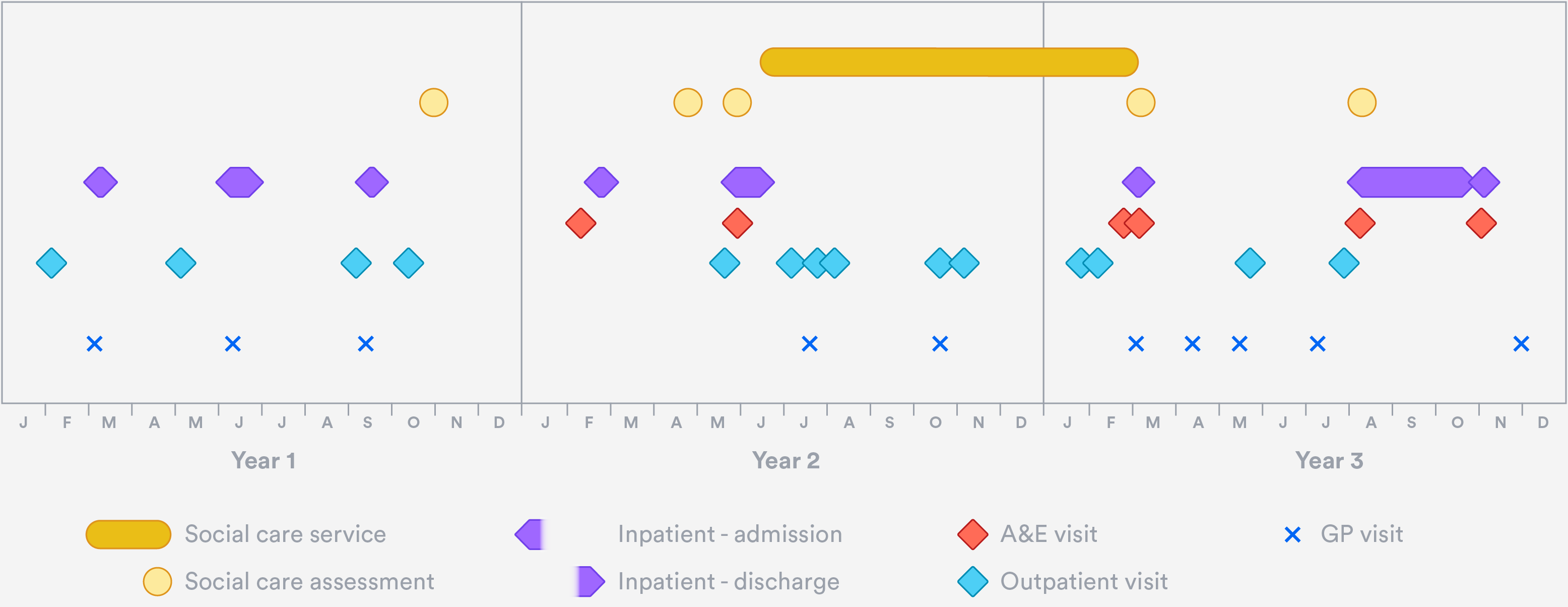
It presents an overview of one older individual’s contacts with their GP, with hospital services and with local authority-funded social care over a three-year period. In this particular case, the chart might prompt us to ask questions about the timeliness of the social care services provided, and whether any more could have been done in primary care to prevent the multiple emergency admissions in the two latter years.
The basic properties of the example chart are as follows:
- It displays information for a single individual.
- The horizontal axis represents a span of time – in this case, three consecutive calendar years.
- Every plotted point on the chart represents one contact the individual had with a health or care provider during the period.
- Contacts with a single service are represented by points on the same horizontal line.
- Different types of contact are displaced vertically from one another to allow the viewer to make out the detail of overlapping contacts. The scale of the vertical displacement has no meaning in itself, but similar types of contacts (such as hospital contacts) are grouped more closely together to help the viewer distinguish more easily between types of service. The shapes selected also help to visually group the points into distinct service types.
- Points that are stretched horizontally represent services that take place over a number of days, such as multiple-day hospital admissions or social care packages of care.
- Some randomness is assigned to the apparent dates of contacts displayed, to ensure we don’t ever disclose information that could identify the individual.
The above chart is just one example, and variants can be built to suit many purposes. It is easy to imagine interactive versions, for example, with the option of viewing greater or lesser detail, and where each point carries additional information (such as the cause of an admission) on mouseover, or on clicking.
What are they good for?
For analysts like me who use linked data to answer specific research questions, these charts can be useful as visual aides when both thinking through and discussing analyses.
But their greatest potential surely lies elsewhere. If these types of chart became standard ways to view data held in cross-sector integrated clinical information systems, clinicians and other care professionals would at a glance be able to see a very large amount of information about individuals in their care. Without having to rely on patients’ day-to-day recollection of their own care, care professionals would see a more complete history – potentially helping them to identify gaps in care, or patterns of events that appear to be concerning.
This type of work is well underway, for example in North West London’s Whole Systems Integrated Care Dashboards and in Graphnet’s Business Intelligence tools.
And as online access to our own health data becomes a reality, such charts could help patients understand their own health journeys, and make health and care information easier to interpret.