
It would sound like damning with faint praise if your report on a recent interaction with the NHS was: “Well, I wasn’t harmed by it." But both hospitals and community care settings are complex, dangerous places in many ways.
The famous phrase “First, do no harm” (dating at least as far back as the 1600s), might sound easy to follow, but anybody who has worked in healthcare would tell you that there’s a difference between sounding easy and being easy.
Rates of harm are at an all time low
The Health and Social Care Information Centre has demonstrated its commitment to this issue by launching The Safety Thermometer, a point of care survey which measures how often patients experience certain key harms, to work out levels of ‘harm-free care’. More than five million patients have been surveyed since it started in June 2012.
A quick look at the QualityWatch harm free care indicator tells us that the vast majority of patients receive care free of these harms. If you take 20 inpatients, about one will have a pressure ulcer (in a community setting it’s slightly more – about one more pressure ulcer per 100 patients). Broadly, it suggests that 6% of people suffer one of these key harms.
This is nothing to baulk at. It takes massive determination and effort to achieve these fairly low levels of harm to patients, particularly when staff are so stretched. Staff should be prouder still of the improvements that have been made, as the percentage of patients being harmed has fallen across the board.
Changes and variation in the quality of data collection mean that some of this should be taken with a pinch of salt (in particular pre-July 2012 the sample is less reliable and was more focused on areas where more patients were harmed). But it’s hard to deny genuine improvement here.
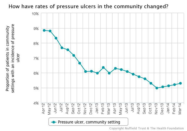
We’re improving, just not as quickly as we were
Richard Nixon is famous (in some circles) for his use of something called the 'third derivative' when he noted that the rate of increase of inflation was falling. The third derivative is basically the rate at which change is changing. With safety data, Nixon would tell us that the rate at which improvement is increasing, is decreasing (or ‘we’re still getting better at getting better, but not as quickly as we were’).
In fact, in some areas improvement seems to have stalled altogether. We need to get to the bottom of this: is it because people have made all the ‘quick wins’ and are now struggling to tackle the more complex, systemic reasons for harm? Because enthusiasm has waned? Because of changes in data collection?
> See more harm-free care indicators
Across the board, the data seem to show this plateau (for an example, see above). If you’re a ‘glass-94%-full’ kind of person, you may think “we’re doing as well as we can”, but if you’re a ‘glass-6%-empty’ kind of a person you may think, "we’re doing as well as we can using these methods, but we need a new approach to do better".
Likewise, while there’s been regional and national focus on these harms, we need to think beyond picking off harms one by one and start thinking about how to be safe, rather than just reacting to specific indicators.
‘Uncontrolled variation is the enemy of quality’ – W. Edwards Deming
If thinking about the third derivative gives you a headache, there are probably some places you’d rather go to get it treated than others. In some trusts, one in 100 patients experienced harm, whilst in others it was one in six. If you take the average over the last 12 months, the variation is about 15% (the difference between one in 100 and one in seven).
There are reasons for this that aren’t about the care patients are receiving, such as variations in data collection, and some care settings and specialities being harder to avoid harm in than others. These factors alone can’t account for all the variation, leaving the simple truth that some hospitals are safer than others. Equally some wards are safer than others, some clinical specialities are safer than others, and some care settings are safer than others.
It’s important that this isn’t about blaming the least safe, but rather about trying to understand why some are less safe than others, and how they can improve. The Safety Thermometer is not about comparing organisations, but understanding the causes of variation is vital for improvement.
Is ‘harm-free care’ the same as safe care?
We can get a lot from robust indicators on harms in care. They can be used locally for improvement and nationally to see trends in harms to patients. But, of course, they don’t tell the whole picture. As well as knowing how safe care was last month, it’s important to know how safe care is today, and tomorrow.
Part of being safe is about anticipating and preparing for problems, as well as integrating and learning lessons, being sensitive to current operations, and operating reliably. As well, of course, as understanding past harms. Indicators on harm-free care help with many of these domains, but we’ve found that the really mature, safe organisations have a basket of measures and interventions across all of them. This is based on research by Charles Vincent and colleagues, which explores these issues more fully.
So, is care getting safer?
Staff should be tremendously proud of reducing rates of harm to patients. For many out there I’m sure it sounds a little odd to celebrate when there are still patients being harmed in the NHS. But it’s important to praise improvement.
It’s clear that progress needs to be made when you look at the variation and the slowing rate of improvement, but it’s important that we have indicators like those in the Safety Thermometer to shine a light on the harm occurring in the NHS, and to be used as a local improvement tool within organisations. With safety thermometers now being released for maternity, paediatrics, mental health, and medications it’s exciting to see the improvements that can be made with measurement and commitment at the front line.