
Our new series of interactive charts: The NHS in numbers pulls together some key data on health care spending, activity, resources and performance. These charts broadly cover the boom years for health care in the UK, from the late 1990s to the early 2010s, reflecting the latest data publicly available from official sources.
During this period, when Government spending on the NHS rose at the fastest rate experienced throughout its history, both public and private spending on health care increased year-on-year (for recent detailed analysis of spending in the NHS in England, see our March 2013 publication: The anatomy of health spending 2011/12: a review of NHS expenditure and labour productivity).
As a result, health care has become more available, and we have been using increasing amounts of it. Large rises have been seen in hospital use – emergency admissions, inpatient episodes, and outpatient appointments – and there has been a steep increase in the number of prescription items dispensed per person.
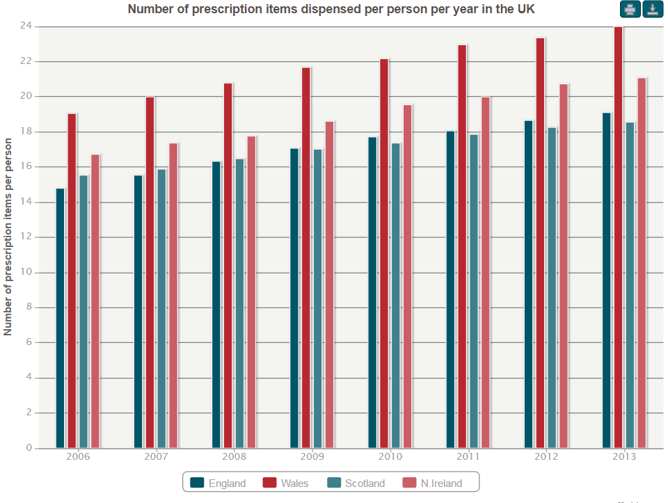
Please note that the interactive version of this chart is no longer available. Please see NHS in Numbers for our full series of up to date charts.
The level of spending needed to support all this extra activity would have been far greater however, had several other changes not been happening in parallel.
In line with policy to reduce time spent in hospital, length of stay has been falling, with reductions in the number overnight beds and increases in day beds to cater for this.
A decrease in the cost of medications over time has mitigated against large increases in the prescribing spend. This has been achieved through policies to limit drug costs and prescribe generic drugs, with several major drugs coming ‘off-patent’ in recent years.
The increase in health care spending has also brought more staff. Numbers of health care staff in hospitals and the community have risen relative to the population size, particularly medical and dental staff. In contrast, this expansion has not been seen in primary care, and there has been little change in the number of GPs per person.
So what has this period of investment in health care achieved?
This is impossible to capture in a single measure, let alone to attribute, however one outcome measure frequently used is the health care amenable mortality rate. This is a measure of premature deaths that should not have occurred in the presence of effective and timely care.
As shown in the chart below, this rate fell by more than one-third over the decade to 2010, with around 21,000 fewer deaths in England from causes considered treatable in 2010 compared with 2001.
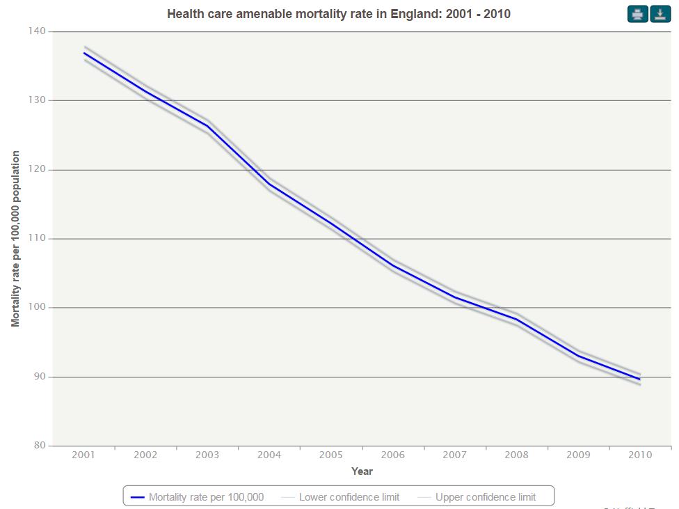
Please note that the interactive version of this chart is no longer available. Please see NHS in Numbers for our full series of up to date charts.
Look out for in-depth analysis from the Nuffield Trust this autumn when we publish, in partnership with The Health Foundation, a follow up to our 2010 comparative study into the funding and performance of the four UK health systems.
Now that we are in tighter times, the boom years have ended.
The 2010 Spending Review halted the period of rapid funding growth for the NHS, and this austerity is set to continue. If recent activity patterns continue and efficiency savings are not achieved, we have previously estimated that the NHS will face a shortfall of around £50 billion by 2021/22 without real increases in funding.
To avoid falls in the quality or availability of NHS care, hospital activity must be managed, including through better preventing and managing long-term conditions. This will require investment in and reform of primary care, and a focus on prevention.
The preventable mortality rate measures deaths avoidable by preventing conditions from occurring in the first place. This has not fallen as rapidly as the health care amenable mortality rate over the past decade. We have got better at treating conditions; we now need to get better at preventing them.
I hope you find these charts useful – we will update them annually, but many of our other projects will provide updated detailed analyses throughout the year.
Suggested citation
Marshall L (2013) ‘The NHS in numbers: performance in the boom years’. Nuffield Trust comment, 17 April 2013. https://www.nuffieldtrust.org.uk/news-item/the-nhs-in-numbers-performance-in-the-boom-years