

Winters historically place the greatest strain upon the NHS, especially in urgent and emergency services, and December 2022 was one of the toughest months yet. Already-struggling services across the country were confronted with an early and significant spike in flu cases, as well as unprecedented strike action from ambulance staff and nurses. The month saw the worst national performance to date on waiting times for ambulances, in A&E departments and for patients on trolleys waiting for a hospital bed.
The Secretary of State gave a speech on 9th January 2023 where he said that the £500 million Adult Social Care Discharge Fund, which was announced in September 2022 to support discharge from hospital to free up beds, would:
“… unblock an estimated 1,000 to 2,000 delayed discharge cases, capacity on wards will be freed up, which will in turn enable patients admitted by emergency departments to move to wards, which in turn unblocks ambulance delays.”
But what does the data from last winter tell us about the bottlenecks through urgent and emergency care? Was the Secretary of State correct to assume that reducing the number of delayed discharges would lead to a chain reaction of improvements along the patient pathway?
Different parts of the health system are clearly interdependent and key voices have referred to the ‘flow of patients’ through urgent and emergency care, where bottlenecks in one place can lead to serious delays for the links in the chain that precede it, leading to gridlock. Bottlenecks can slow down a patient’s journey considerably which can have potentially serious consequences for their health and ability to access timely care. NHS England’s hospital discharge fund for integrated care boards (ICBs) expects them to deliver reductions in delayed discharges, as well as “improvements in patient flow which in turn help waiting times in emergency departments and handover delays”.
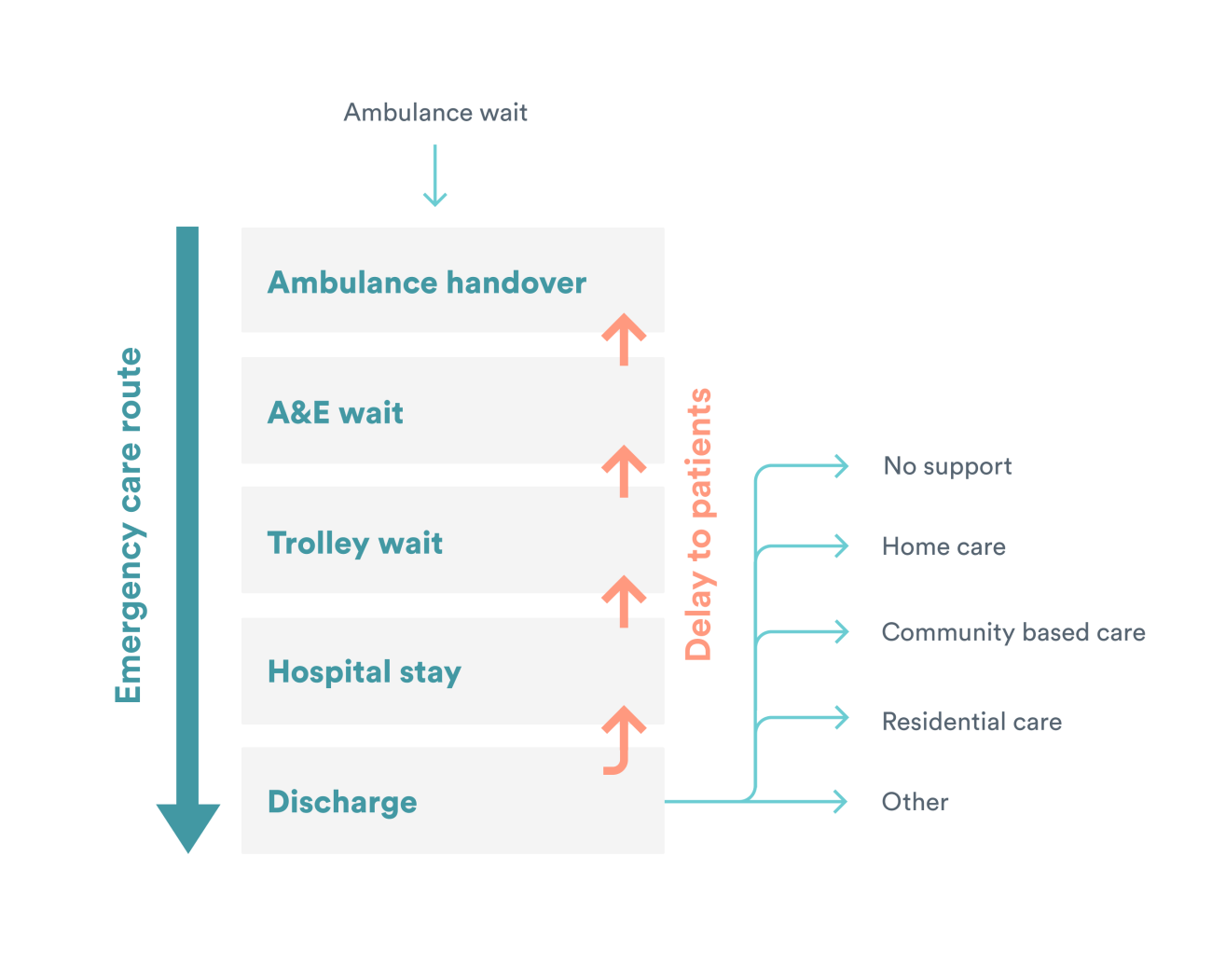
For this QualityWatch long read, we focus on a simplified patient pathway through urgent and emergency care, where a patient begins their journey in an ambulance, followed by a visit to an emergency department, then a stay in a hospital bed, and ends in discharge from hospital (See figure below). The NHS’s ability to meet key targets along this pathway has declined significantly in recent years, with an assumption that gridlock in one part of the pathway impacts on earlier steps.
Understanding patient flow for integrated care systems
The NHS in England is divided into 42 integrated care systems (ICSs) which are responsible for ensuring services in their area work together effectively to improve the quality of care for patients. ICSs vary in size and complexity, serving populations ranging from 500,000 to over three million. To understand how different points along the urgent and emergency patient pathway are related, we analysed data from five measures at an ICS level, using data from last winter (December 2022 to February 2023).
The five measures
- The proportion of ambulance arrivals with a handover delay of >30 minutes. There is a national target which states that 95% of handovers to A&E staff should take place within 30 minutes and 100% within 60 minutes. We analysed the proportion missing the target, and so include a 5% threshold line on our charts.
- The proportion of patients spending >4 hours in A&E from arrival to departure. There is a long-standing national target for this measure, that at least 95% of patients attending A&E should be admitted, transferred or discharged within four hours. In mid-December 2022, an intermediary threshold target of 76% to be hit by March 2024 was introduced. The proportion missing the four-hour target are displayed on the charts.
- Trolley waits – the proportion of patients with a decision to admit who waited >4 hours to be admitted to hospital. While there is no national target set for trolley waits, these waits are broadly known as ‘corridor care’ with large numbers of them posing a risk to patient safety.
- The percentage of overnight hospital patients with a length of stay of ≥21 days. Reducing the number of patients with a long length of stay has been a national focus in recent years, including during the pandemic. Not all hospital patients with a length of stay of three weeks will be ready for discharge, but a large proportion of them will be facing delays to leave hospital.
- The percentage of patients who had a delayed discharge from hospital. Reducing the number of delayed discharges has been a key policy focus for the NHS, with government announcements of cash injections aiming to reduce their numbers. While there is no national target set, it is broadly accepted that too many delays can lead to ‘bed-blocking’ and delays to be admitted to hospital.
By looking at performance across the five measures, from ambulance handover delays through to delayed discharge from hospital, we investigated:
- How much variation in performance there is between ICSs for each measure on this patient pathway.
- Whether there is correlation across the urgent and emergency care pathway at an ICS level, with some ICSs performing better or worse on multiple measures.
Given the longstanding challenge of gridlock across the urgent and emergency care pathway, we hypothesised that ICSs that are performing worse on A&E waiting times would have more ambulance handover delays. That ICSs with a larger proportion of long-stay (≥21 days) hospital patients would have more trolley waits to be admitted. And that ICSs with more delayed discharges would have more patients with long lengths of stay in hospital.
How does urgent and emergency care performance vary across ICSs?
The chart below shows how each ICS performed for each of our five measures in the most recent winter. Each column represents an ICS and they have been ranked from worst to best performing.
Before analysing our findings, it is important to bear in mind that while some ICSs may be performing better than others on specific measures, performance across the board is far poorer than desired. All ICSs are missing the headline targets for ambulance handover delays and A&E waits, and they are generally faring badly on the other measures too.
Some measures show greater variation between ICSs, while others indicate more nationwide consistency. In the winter of 2022-23, ambulance handover delays saw the biggest gap between the best and worst performing ICSs, of 63 percentage points. On the other hand, only 3 percentage points separated the ICS with the highest proportion of overnight hospital patients with a length of stay of over 21 days and the ICS with the lowest proportion. There were particularly better and worse-performing ICSs for some measures such as trolley waits, but overall, there were a limited number of outliers.
Ambulance handover delays were the most spread, with the better performing half of ICSs averaging 20% of ambulance arrivals with a handover delay of over 30 minutes, while for the worse performing half, this figure was 43% (a gap of 23 percentage points). On the other hand, the A&E waiting times had a gap of 9 percentage points between the better performing half of ICSs (33% over four hours) and the worse performing half (42% over four hours). No ICS performed close to the long-standing national target of no more than 5% of A&E waits lasting over four hours, with the best performing ICS still having 26% of patients wait this long.
Is there a relationship between the different measures at an ICS level?
Next, we explored whether the measures are correlated at an ICS level across various intersection points along the patient journey. For example, do ICSs that are performing better on trolley waits also have shorter waits in A&E? Do ICSs with higher rates of delayed discharges have more patients with long lengths of stay in hospital? If they were strongly related, we would expect the scatter plots to show an obvious sloping linear pattern.
We can see that there is little correlation at an ICS level between these pairs of measures because there is no noticeable sloped linear pattern. An example is the ICS which has the lowest proportion of trolley waits >30 minutes but sits towards the middle of the pack for A&E waiting times. The hypothesis that we would see a clear relationship between adjoining measures along the pathway at an ICS level appears to be false.
We also analysed whether delayed discharges in particular were correlated with any of the other measures in the backlog pathway, given the significant policy focus on funding for discharge to reduce bottlenecks. There was no relationship found, at least at an ICS level, between the proportion of patients who had a delayed discharge from hospital and performance on trolley waits, A&E waits, ambulance handover delays or long lengths of stay in hospital (data not shown).
Why isn’t there a clear correlation across the urgent and emergency care pathway at an ICS level?
The concept of gridlock through urgent and emergency care is commonly referred to and is often attributed to a lack of capacity in social and intermediate care, leading to delayed discharges in hospital that in turn back up the system. There is no doubt that pressures are being felt across urgent and emergency care, with ICSs missing key waiting times targets and actions needed to minimise risks to patient safety. Despite the immense challenges, our analysis shows that, at least at an ICS level, poor performance on delayed discharges or any of the other measures is not associated with worse performance earlier in the patient pathway. Even the measures which relate specifically to emergency departments – trolley waits and A&E waiting times – appear to lack clear correlations at an ICS level.
To gain a better understanding of this mixed picture, we spoke to three ICSs to ask them about patient flow through their services and whether there are local factors that might explain the lack of clear correlation between different measures. There were various insights gained from these discussions:
Firstly, ICS-level data masks trust-level factors. Most ICSs preside over multiple hospital trusts which may be very different from one another. Hospitals within an ICS may cover significantly different patient populations, be organised and structured in unique ways (both in terms of leadership and management, and physical infrastructure), and be burdened with capacity pinch-points in different places. Some ICSs are made up of hospital trusts which sit under the geographical scope of different ambulance trusts. This may lead to hospitals within an ICS having different strengths and weaknesses. In such a scenario, aggregating data would obscure patterns which exist at a more granular level.
Secondly, the way backlogs are commonly understood may not be reflected in practice. There is not a one-size-fits-all approach to patient flow. Sites manage emergency admissions in divergent ways, such as through AMUs (Acute Medical Units) where some patients are assessed and treated after leaving A&E, who otherwise may have waited for a bed on a specialist ward or spent longer in A&E. Not all hospitals have an AMU, and so this would have implications for A&E and trolley wait data. Furthermore, some patients arriving by ambulance may not go to A&E but could instead be admitted directly onto a specialist ward. More generally, there are different routes that a patient can take through urgent and emergency care, especially the steps leading up to hospital admission, and a patient’s journey may not follow the simplified version we set out earlier.
The pathway also does not account for interdependencies with other parts of the health and care system. Elective care operations are often put on hold in order to absorb bed demand from emergency admissions. These trade-offs would not be visible in our data and trusts may make different decisions on how to minimise patient harm. Cancelling elective operations to increase bed capacity for emergency patients would make it more difficult to reduce the waiting list for elective care. The negative consequences of this may be less immediately visible, but the repercussions may be that very long waiters are more likely to require emergency procedures as their condition deteriorates.
Furthermore, hospitals may individually choose to focus their performance improvement efforts in certain areas and may excel at removing bottlenecks in some areas while placing less focus upon others. For example, some trusts may put a lot of effort into producing patient discharge plans in a timely manner but may struggle to keep a steady flow of patients moving between A&E and their wards. Others may have a lower tolerance for ambulance handover delays but might allow A&E departments to become more crowded. The variability in priorities relates to services taking different approaches with the goal of minimising risk to patient safety.
Finally, the way we measured performance on certain aspects of the pathway could impact the degree of correlation we saw. For example, we were able to access data on the number of patients who faced any delay leaving hospital, as a proportion of people who were assessed as ready to leave. Had we been able to specify this according to how many days patients were delayed, this might have affected the level of correlation. Moreover, like the health system as a whole, every ICS is currently facing significant pressures to meet the level of demand for urgent and emergency care, which could obscure patterns. In a system where at least some aspects of our pathway were performing in line with standards, relationships may have been easier to spot.
Final word
Our analysis shows that oversimplifying the reasons for gridlock through urgent and emergency care can obscure the complex sets of factors that drive these issues. People running these services who are planning for what will undoubtedly be a challenging winter ahead need to understand their local pathways and use data to understand their specific drivers of hospital backlogs.
While it might sound attractive to policy makers, ‘fixing’ discharge, or any other specific aspect of the service, is unlikely to act as a silver bullet for patient flow when local factors are so pivotal to the challenges (and solutions) facing hospitals. Initiatives adapted to local circumstances can make a big difference in addressing specific problem areas in urgent and emergency care and are likely to provide the best opportunity for improving patient flow this winter.
Methodology
The five measures along our simplified patient pathway through urgent and emergency care are defined as follows:
Ambulance handover delays – the proportion of ambulance arrivals that had a handover delay of >30 minutes.
Source: Nuffield Trust analysis of NHS England, Urgent and Emergency Care Daily Situation Reports 2022-23
A&E waiting times – the proportion of people attending Type 1, 2 or 3 emergency departments that left the department more than four hours after arriving
Source: Emergency Care Data Set (December 2022 to February 2023) Copyright © 2023, re-used with the permission of NHS Digital. All rights reserved.
Trolley waits – the proportion of patients with a decision to admit who waited >4 hours to be admitted to hospital.
Source: Emergency Care Data Set (December 2022 to February 2023) Copyright © 2023, re-used with the permission of NHS Digital. All rights reserved.
Long lengths of stay in hospital – the proportion of discharged patients (who had at least one overnight stay in hospital) who had a length of stay ≥21 days.
Source: Hospital Episode Statistics (December 2022 to February 2023) Copyright © 2023, re-used with the permission of NHS Digital. All rights reserved.
Delayed discharges – the proportion of patients that were not discharged who no longer met the criteria to reside in hospital
Source: Nuffield Trust analysis of NHS England, Urgent and Emergency Care Daily Situation Reports 2022-23
All of the charts included in this piece display data for the most recent winter, December 2022 to February 2023 inclusive.
What methodology was used to generate the measures at an ICS level?
For the A&E waiting times, trolley waits and length of stay measures we used SAS software to generate ICS level data using the Emergency Care Data Set (ECDS) and Hospital Episode Statistics (HES) Admitted Patient Care dataset. We were able to allocate activity to a particular ICS based on the Lower Layer Super Output Area (LSOA) in which a patient lives, based on mapping published by the Office for National Statistics.
The process used to generate the ambulance handover delay and delayed discharge data at an ICS level was slightly different. This is because we needed to convert publicly available data that is presented at trust level, to ICS-level. While there are already crude mapping tools available, we generated our own trust to ICS map based on type 1 emergency department activity as recorded in ECDS. This mapping apportioned each trust’s activity to one or more ICSs and allowed us to regroup by ICS.
Once we produced the trust to ICS mapping, we were then able to import the trust level data in SAS and convert it to ICS-level data.
The code used to generate all of the measures and the trust to ICS mapping tool can be found on GitHub.